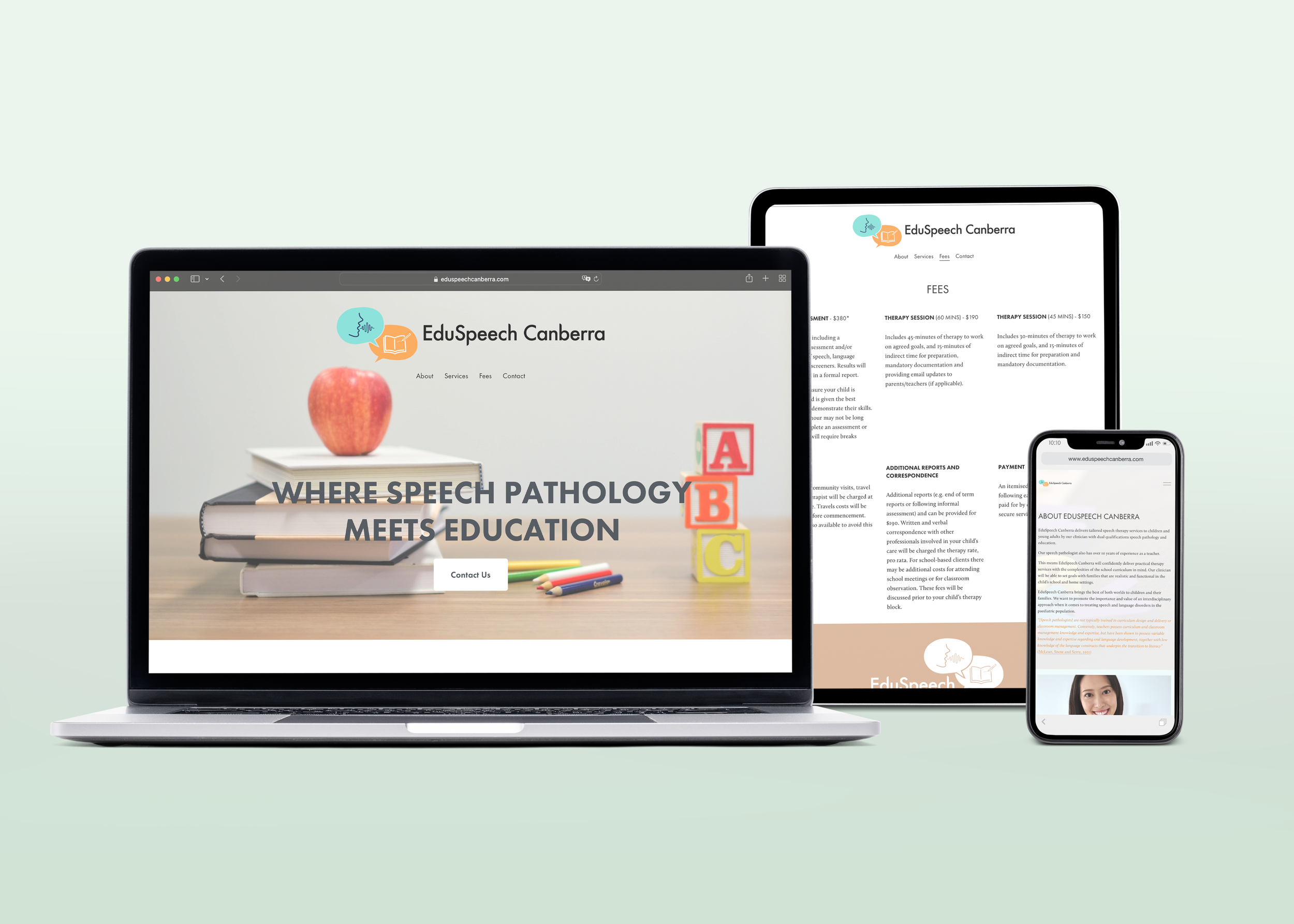
“Where speech pathology meets education.”

The Client
The client was a speech pathology practice looking to create a new visual identity that will appeal to both children and parents.
The client’s goal was a visual identity that touches on both the future educational prospects of the business, while communicating the current service of speech pathology.
The Audience
The primary target audience is children between the ages of 3 and 12, as well as their parents. I developed a brand that is visually appealing to children.
I reviewed copy for the website to provide parents with clear and informative messaging about the client’s speech pathology expertise, methodology and services .
The Visual Identity
The visual identity incorporates bright and playful colors, with a focus on fun and engaging imagery that will appeal to children, yet remains professional.
I developed an identity that feels welcoming to children and parents, while also communicating the expertise and professionalism of the client’s speech pathology practice.